The Assignment
Condorsight
|
Condorsight is developing a mentorship laboratory for professionals, by professionals. Its mission is to help and inspire LATAM professionals toward a higher level of vision, excellency, and global competitiveness.
One of their foundational steps was to develop a brand identity that effectively represents and communicates the mission and vision of the organization. They had previously chosen the Andean Condor as a symbol due to its metaphorical relevance and rich, cultural meaning throughout great parts of Latin America. The Condorsight tagline says, "A mayor altitud", which in Spanish means to fly "at higher heights", just like an Andean Condor. |
The Process
Research
Research
|
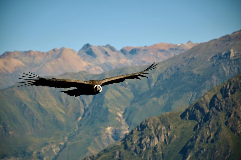
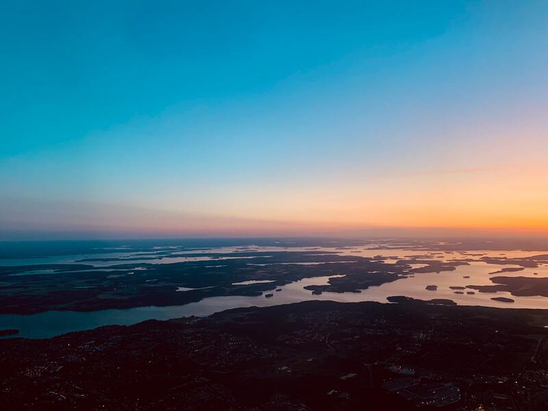
The first step was to visually analyze what an Andean Condor looks like, where it lives, and how it behaves. I decided to not only take it's body as inspiration, but also the mountains it lives in and the particular atmospheric colors of the sky when it flies at higher heights.
|
|
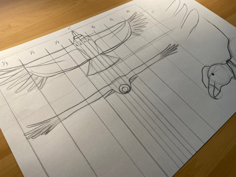
The next step was to analyze the Andean Condor's anatomy to better understand its dimensions, proportions, and unique characteristics. This would come in handy when sketching.
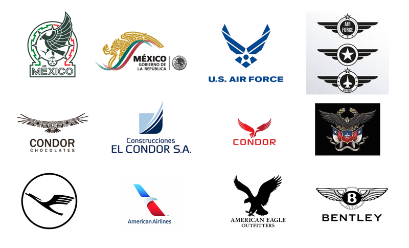
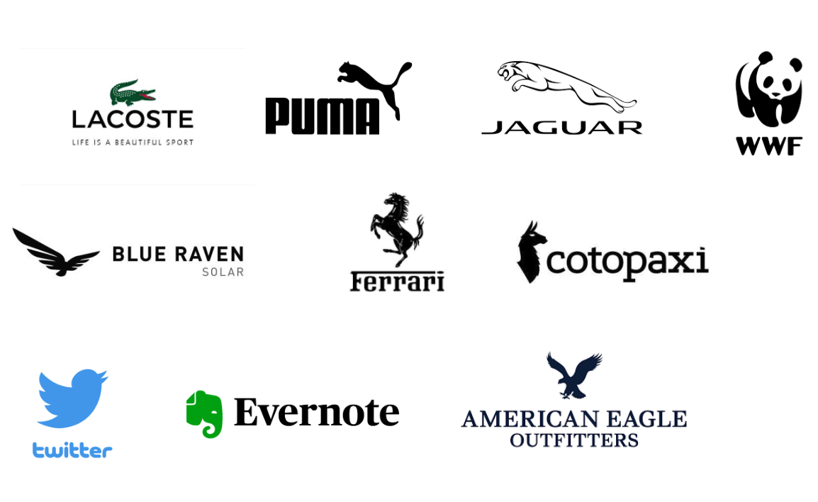
Additionally, I gathered the logos of prominent bird, and animal-based, logos to get a clear sense of what has worked well and what hasn't. |
Sketching and brainstorming.
|
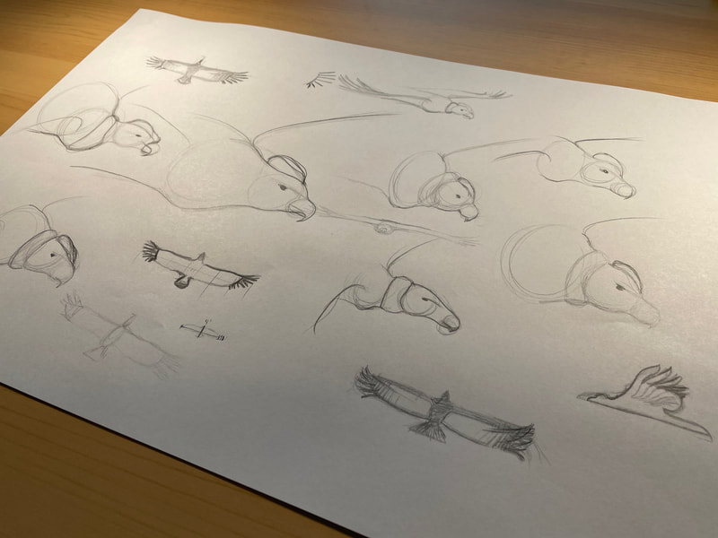
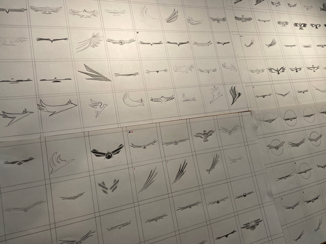
In collaboration with the client, over 100 sketches were created making key decisions along the way that would result in the chosen creative solution.
|
The Result
Logo mark and logotype
Logo mark and logotype
|
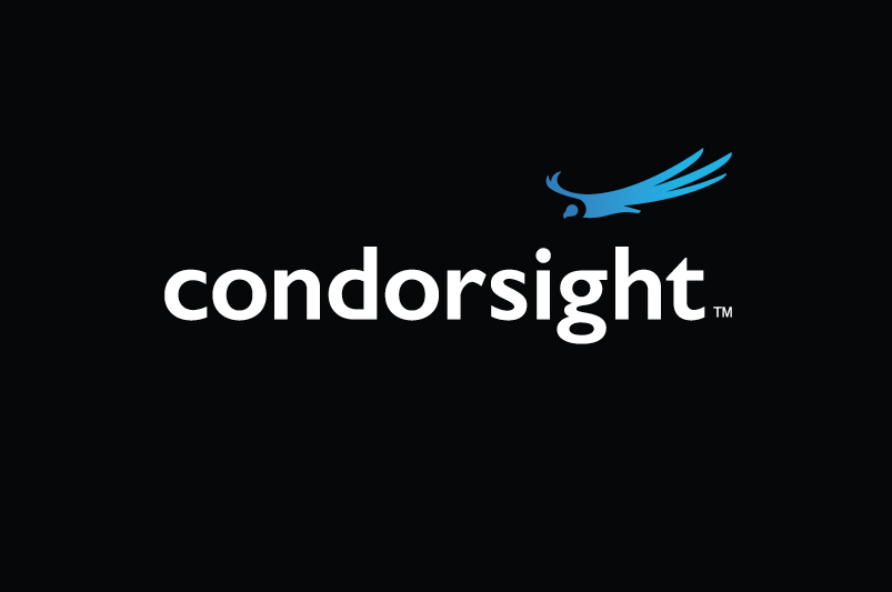
The resulting logo mark is a simple, stylized Andean Condor constructed with two shapes—the head and the body. These two are separated to create a lost and found effect with the white neck collar that distinguishes the Andean Condor from its relatives. The bird is shown in a gliding motion from a three-quarter perspective, detailing the top three feathers of the left wing and the top two of the right. This provides a sense of majestic dynamic at high altitude. Additionally, the gradient blue color correlates well with the idea of flying, the sky, and altitude.
|
|
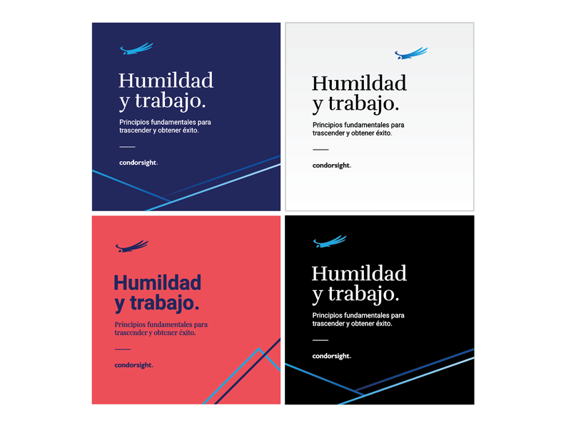
The same process was implemented to choose a word-mark typeface, to create the brand elements, and to build the initial marketing communication pieces. The logo mark faces left to fulfill two purposes: 1) to give priority to the word mark of the brand name, and 2) to lead viewers back to the brand name, creating a cohesive visual experience.
Primary and accent colors were taken not only from the basics of color theory but also from a study revealing the most used colors in LATAM flags and culture. |

